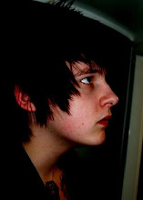
The second set of results proved to be a big inspiration for the character of my ideal man:
After asking a group of 30 men 10 simple questions which women had stated were means worst habits these were the results.
28/30 - 96.2% of men leave empty containers around the house
Lazy
17/30 - 60% of men leave shaving hair in the sink
Un-hygienic
16/30 - 56% of men use more cups instead of one
Messy
26/30 - 90.3% of men have selective hearing
Ignorant
20/30 - 69.5% of men never pick up dirty laundry
Smelly
23/30 - 81.3% of men avoid doing housework
Inconsiderate
15/30 - 50% of men are helpless when sick
Moans
28/30 - 96.2% of men admit to burp and farting
Rude
21/30 - 73.5% of men wear the same clothes over and over
Gross
22/30 - 66% of men channel surf
Annoying
Out of all the results not one hit under average, so I believe this builds up quite an accurate character to bass my audience on, and as a woman’s point of view this person will be:
A lazy, ignorant, un-hygienic, annoying, rude, messy, smelly, gross, inconsiderate moaner.
To us this is
Someone who isn't too bothered about hygiene
Is a little sexist and
Isn’t afraid of saying something to someone
i.e. - Danny Dyer = sexist, he treats women like objects which is not what I want to promote... but in a way is exactly what I need to promote without causing to much offence to women
Thursday, 29 April 2010

results #2
After asking a group of 30 men 10 simple questions which women had stated were mens worst habbits these were the results.
28/30 - 96.2% of men leave empty containers around the house
Lazy
17/30 - 60% of men leave shaving hair in the sink
Un-hygenic
16/30 - 56% of men use more cups instead of one
Messy
26/30 - 90.3% of men have selective hearng
Ignorant
20/30 - 69.5% of men never pick up dirty laundry
Smelly
23/30 - 81.3% of men avoid doing housework
Inconsiderate
15/30 - 50% of men are helpless when sick
Milking it
28/30 - 96.2% of men admit to burp and farting
Rude
21/30 - 73.5% of men wear the same clothes over and over
Gross
22/30 - 66% of men channel surf
Annoying
Out of all the results not one hit under average, so I believe this builds up quite an accurate character to bass my audience on, and as a womans point of view this person will be:
A lazy, un-hygenic, annoying

results #1
After I correlated all the results I broke them down into statistical facts based upon my questions and he answers given
2/100 use someone else
3/100 use a scarf
3/100 use a glove
3/100 use their t-shirt
7/100 use a hanky
10/100 use their hand
10/100 use a napkin
12/100 blow it out of their nostril without wiping
15/100 use a tissue
35/100 use their sleeve
• This means that 35/100 males use their sleeves to wipe their nose than anything else
• 15/100 use a tissue already
• 85/100 males think that tissues are un-cool although only 43/100 think that Kleenex tissues are un-cool
• ¼, Males shops alone, ¾ times a woman does the shopping/ is accompanied by a woman.
These statistics prove that:
- The man is not the main shopper
- Tissues are not seen as a priority
- Men would in-fact rather use a sleeve rather than a tissue
- Tissues are un-cool but Kleenex is alright
- The packaging is not masculine enough
This means that the above bullet points point out the problems and create a new brief for me:
The tissues need to now been seen as a priority advertised in an out of super-market context and the packaging needs to be more masculine.
I personally am thinking of context:
Male toilets - tussue dispencer - GETTING LUCKY? GOING HOME ALONE
I am going to draw that up NOW cause I just fell in love with the idea
2/100 use someone else
3/100 use a scarf
3/100 use a glove
3/100 use their t-shirt
7/100 use a hanky
10/100 use their hand
10/100 use a napkin
12/100 blow it out of their nostril without wiping
15/100 use a tissue
35/100 use their sleeve
• This means that 35/100 males use their sleeves to wipe their nose than anything else
• 15/100 use a tissue already
• 85/100 males think that tissues are un-cool although only 43/100 think that Kleenex tissues are un-cool
• ¼, Males shops alone, ¾ times a woman does the shopping/ is accompanied by a woman.
These statistics prove that:
- The man is not the main shopper
- Tissues are not seen as a priority
- Men would in-fact rather use a sleeve rather than a tissue
- Tissues are un-cool but Kleenex is alright
- The packaging is not masculine enough
This means that the above bullet points point out the problems and create a new brief for me:
The tissues need to now been seen as a priority advertised in an out of super-market context and the packaging needs to be more masculine.
I personally am thinking of context:
Male toilets - tussue dispencer - GETTING LUCKY? GOING HOME ALONE
I am going to draw that up NOW cause I just fell in love with the idea
Results
I had made these questionnaires based on a certain audience. The audience whom were male, between the age of 18 and 24 and were in a relationship/ married as opose to the single men as they would do a lot of the asked questions them selves. To get an accurate responce I made 100 questionnaires and correlated all the answers together to get some hard facts I could later rely on with my design work.

As can be seen the questions were simple:
1 - what do you use to wipe your nose?
This was to find out how many men used tissues and wether or not the brief was relevent
2 - Do you think kleenex tissues are un-cool?
This was to discover wether it was a branding problem/ something kleenex has done which puts men off purchasing it
3 - Do you do the shopping or does your partner?
This was to determen wether a man actualy has a say in the matter/ wether the advertising in the supermarket is enough?
4 - Would you purchase Kleenex tissues if they were more manly?
This is to do with the ackaging and to decifer if I should consider a re-branded packaging for the young adults so it is something for JUST them.

Out of all the questionnairs I had to tally up the results and find out what the statistical information was and wether or not the earlier comments I made in my blog were true.

Below is the also filled out form inwhich was completed to find out how well men related with the description of the stereotypical man from a womans point of view.

These results were out of 30 and cut down into percentages for a fast statistical average.


As can be seen the questions were simple:
1 - what do you use to wipe your nose?
This was to find out how many men used tissues and wether or not the brief was relevent
2 - Do you think kleenex tissues are un-cool?
This was to discover wether it was a branding problem/ something kleenex has done which puts men off purchasing it
3 - Do you do the shopping or does your partner?
This was to determen wether a man actualy has a say in the matter/ wether the advertising in the supermarket is enough?
4 - Would you purchase Kleenex tissues if they were more manly?
This is to do with the ackaging and to decifer if I should consider a re-branded packaging for the young adults so it is something for JUST them.

Out of all the questionnairs I had to tally up the results and find out what the statistical information was and wether or not the earlier comments I made in my blog were true.

Below is the also filled out form inwhich was completed to find out how well men related with the description of the stereotypical man from a womans point of view.

These results were out of 30 and cut down into percentages for a fast statistical average.

The results will be documented into facts in a later post
to prove the previous, questionnaires
This questionnaire is based on the male tissue packaging and the answers when completed will be put into this mock up box I made. This questionnaire however bases its questions on men in relationships and how the product is marketed, this will let me know why men don't use the tissues, wether it is because of the packaging, the fact they don't go shopping or something completely different.

This is relevant as if these are true it builds a strong character for my audience and narrows everything down which will make my design direction a lot more accurate and ordered to help me investigate who my audience actualy is.

This next questionnaire is based upon the ten worst male habits and wether or not men agree with them, it is based from an article wrote from a womans point of view which is on my design context:


This is relevant as if these are true it builds a strong character for my audience and narrows everything down which will make my design direction a lot more accurate and ordered to help me investigate who my audience actualy is.

Wednesday, 28 April 2010
Design sheets
I drew out a mind map to help joht down some ideas in which I could consider and later develop into visual ideas. Kleenex tissues for men is the main catagory and from that I thought about key areas which ought to be targeted for this campaign.

One area I stumbled across was 'role models' as in my docuented research located on my Design Context blog for this module states, Kleenex have been very rle model efficient recently with their 'let it out' advert featuring stars such as Bob Geldoff, Emma Bunton and Sven Gorron Erikson. To me I think it is an ideal opourtunity to think about certain male role models and what their values are:
They need to be good looking, as it leads to a form of respect for how they look/ dress
They need to be popular/ famous so all men know who they are.
They need to be strong, wether that is mind or strength i.e. hard men or Smart men such as comedians like Jimmy Carr
Most of all they need to be respected by all others around them in order for the campaign to work.

Another sub catagory was about the apearence of the product and what would make Kleenex more apealing for men. Certain areas thought of were the packaging, logo/ branding, colours and context of advertisments/ sense of approach

What do men actually use tissues for?
Again this image relates to what would make the item more male orientated. A campaign already used by Kleenex is to make a 'Man Sized Tissue' which is what I believe to be appropriate in thecontext of a home. I believe that I am focusing on the promotion of using a tissue in an outdoor context where it would be more appopriate to men as thy are the ones that don't carry tissues around with them as a general rule.

Linking in with my role model concept I drew a quick image of Mr.T. in his famous A-Team pose but sneakly replacing certain elements of the image with Kleenex and a catch phrase. This is something I am going to later develop to see whether it can lead to something greater or just stop there. The idea of it is that these are men young men relate to and respect because of the reputation and how 'Hard/strong' they are.

This is an interesting idea I came up with which I would also like to take into a little more detail. This is a packaging rebrand in whic the label of the box/ packet would be changed to something like 'filthy pig' as that is a term commonly used about/ to men for doing discusting things such as belching, farting and picking their nose. This could have some strong bennefits of retail if developed correctly however if not this could be catastrophic in relations to my set target audience and may lead to being branded to women for men. I think this brief is about making men buy it not women.

This is a silly idea which is worth more on paper than reality, but originaly it was the merchandise sold by Kleenex, the concept was a cuff you could attatch around you're sleeve and with a velcro strip you could wrap a tissue around it and then use you're sleeve to wipe your nose..

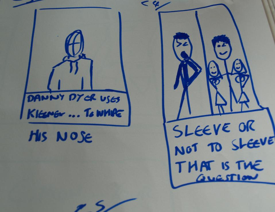
Again role models. Danny Dyer as he is the average Northern mans aspiration to be. He essentialy is a pig to women yet he gets them. I thought about a subliminal tag line such as 'DANNY DYER USES KLEENEX... TO WIPE HIS NOSE'
Again another subliminal refrence in this tagline:
C/8 is basically the same as the above but showing a man wiping his buggers on his girls behind where she can't see it a bit like a child.
But with this superman idea, a whole different message/joke can be seen.

It is a bit like the simpsons how the cartoon is for kids but then it is also for adults.. I think the image more or less elaberates my point.

The final thing I came up with on these design sheets was some subliminaly rude messages which I believe are a bit to out there/ obvious on what the other meaning is.

One area I stumbled across was 'role models' as in my docuented research located on my Design Context blog for this module states, Kleenex have been very rle model efficient recently with their 'let it out' advert featuring stars such as Bob Geldoff, Emma Bunton and Sven Gorron Erikson. To me I think it is an ideal opourtunity to think about certain male role models and what their values are:
They need to be good looking, as it leads to a form of respect for how they look/ dress
They need to be popular/ famous so all men know who they are.
They need to be strong, wether that is mind or strength i.e. hard men or Smart men such as comedians like Jimmy Carr
Most of all they need to be respected by all others around them in order for the campaign to work.

Another sub catagory was about the apearence of the product and what would make Kleenex more apealing for men. Certain areas thought of were the packaging, logo/ branding, colours and context of advertisments/ sense of approach

What do men actually use tissues for?
- A man is more likely to hurt their self via stupidity or fighting, which would lead to blood
- Other waste such as shit and seamen
Where as women would tend to use the item for:
- Crying
- Cleaning a spill
- Make up
- Nose

Again this image relates to what would make the item more male orientated. A campaign already used by Kleenex is to make a 'Man Sized Tissue' which is what I believe to be appropriate in thecontext of a home. I believe that I am focusing on the promotion of using a tissue in an outdoor context where it would be more appopriate to men as thy are the ones that don't carry tissues around with them as a general rule.

Linking in with my role model concept I drew a quick image of Mr.T. in his famous A-Team pose but sneakly replacing certain elements of the image with Kleenex and a catch phrase. This is something I am going to later develop to see whether it can lead to something greater or just stop there. The idea of it is that these are men young men relate to and respect because of the reputation and how 'Hard/strong' they are.

This is an interesting idea I came up with which I would also like to take into a little more detail. This is a packaging rebrand in whic the label of the box/ packet would be changed to something like 'filthy pig' as that is a term commonly used about/ to men for doing discusting things such as belching, farting and picking their nose. This could have some strong bennefits of retail if developed correctly however if not this could be catastrophic in relations to my set target audience and may lead to being branded to women for men. I think this brief is about making men buy it not women.

This is a silly idea which is worth more on paper than reality, but originaly it was the merchandise sold by Kleenex, the concept was a cuff you could attatch around you're sleeve and with a velcro strip you could wrap a tissue around it and then use you're sleeve to wipe your nose..

Again role models. Danny Dyer as he is the average Northern mans aspiration to be. He essentialy is a pig to women yet he gets them. I thought about a subliminal tag line such as 'DANNY DYER USES KLEENEX... TO WIPE HIS NOSE'
This is basically stating he uses kleenex and the average drifting minded male goes yeah for a down stairs spillage. However my favorite tag is:
'TO SLEEVE OR NOT TO SLEEVE, THAT IS THE QUESTION'
The image basically shows two images of the man using his sleeve and looking gross and then some stud who uses kleenex with some babes, This campain is using sex appeal to get what it wants, it is basically stating that a woman doesn't want a man with slimey sleeves and a red nose, but a man with clean sleeves and a clean nose.
Again another subliminal refrence in this tagline:
' KLEENEX... GETS YOU OUT OF THOSE 'STICKY' SITUATIONS'
This basically showing a man with his girlfriend romantically swhiping her off her feet in a lovely new dress, but he hasn't cleaned his sleeves and has left a Big mucus stain all down her lovely new hand wash top.. the tag line is stating if he would of used kleenex he wouldn't have to be buying her a new dress and himself a new bed for when she finds out.

C/8 is basically the same as the above but showing a man wiping his buggers on his girls behind where she can't see it a bit like a child.
Next to it on the left is aother idea I would like to take forward which is all about using child hood role models/ superheroes to promote using Kleenex and stop using a sleeve.

But with this superman idea, a whole different message/joke can be seen.

It is a bit like the simpsons how the cartoon is for kids but then it is also for adults.. I think the image more or less elaberates my point.

The final thing I came up with on these design sheets was some subliminaly rude messages which I believe are a bit to out there/ obvious on what the other meaning is.
Fancy a blowy - it means a tissue you think foreplay
Don't want to make a mess - it means of your clothes you think over yourself/ sock
Sticky situation - it means snot you think ejaculation
Golden brown texture like sun - it means the song you think of that dirty boogie you just carved out your nose with your forefinger.

I am going to develop a few more ideas based on these designs developed to see how they look and wether they are appropriate in tone and audience.
Sunday, 11 April 2010


Saturday, 27 March 2010
Thursday, 25 March 2010


Sunday, 21 March 2010


Context photos: featuring Peter Sands as turbo man
Within the context of these photos our aim was to have a model running which matched the logo of one of our flavours of drink, The image turned out alright but I wasn't fully satisfied with how good they could have been if I had organised them a little better and perhaps took hundreads of photos rather than just 20, Ironicly the image I have chosen to use is one of were Peter was having a little joke around, but as a result it fitted in with the context of the image perfectly.


Friday, 19 March 2010


design boards
For the design boards I thought that it would be appropriate to pick a relevant colour scheme, I chose 5 colours which were/ could be used Light blue, like a sky for the background as it is in so many of their designs already. I think that the use of the four re branded bottles would be good. Red purple green and yellow if I remember correctly. Now if these colours are combine it makes a kind of rainbow which I think is relevant to feel good. However this isa lot of colours to be messing about with and may distract from the actual boards content.

Which is why I carried out some layout experiments. I possibly think that the plain blue colour on its own would be far better suited than any of the other design examples below. (thats the first one on the top left.) I think as I mentioned earlier that the combination of to many colours strays away from making the board stand out. At the end of the day we want the judges drawn to the image and not a pretty border.


Which is why I carried out some layout experiments. I possibly think that the plain blue colour on its own would be far better suited than any of the other design examples below. (thats the first one on the top left.) I think as I mentioned earlier that the combination of to many colours strays away from making the board stand out. At the end of the day we want the judges drawn to the image and not a pretty border.

After the crit we were told tat ou campaign would be based more accuratley to a target audience of women. Which we ageed was true, although I believe that the drinks should notbe exclusive to women, it is afterall the 21st century.
I think that if the product logo was changed to all women playing sports then the male audience's that may of bought the drink would no go near it now. Which is why I thought that we should keep at least one male sports player rather than change them all to women
Although we are in the process of changing all of the sillouettes into women now. Being opposite sexes in the team gives a different points of view, which is something I have accepted as the drink is more appealing to women, Anna would have a better approach of how to tackle the subject. Were as if it was approached to males I would have a better concept of approach.
Overall I think that everything is going well, our aim is to have the labels printed tonight with the main logos, and a photo in context to be taken as we are stearing close to that dreaded deadline.
I think that if the product logo was changed to all women playing sports then the male audience's that may of bought the drink would no go near it now. Which is why I thought that we should keep at least one male sports player rather than change them all to women
Although we are in the process of changing all of the sillouettes into women now. Being opposite sexes in the team gives a different points of view, which is something I have accepted as the drink is more appealing to women, Anna would have a better approach of how to tackle the subject. Were as if it was approached to males I would have a better concept of approach.
Overall I think that everything is going well, our aim is to have the labels printed tonight with the main logos, and a photo in context to be taken as we are stearing close to that dreaded deadline.
Thursday, 18 March 2010
Bottle labels
I have been developing the rest of the label as Anna works on the logos, as I have been unable to identify the typeface or download one, I have used my graphics tablet to trace over a scanned version of the label... this took a while. One of the critical images on the label was the one shown below:
Now I had to drag this image off of the internet and edit the photo into a duo tone on photoshop in order for the whole label to look neat and legible.

Below is the Cloudy Lemon label, All that is missing now is the logo in the center, I am happy with the overall finish of the product and when it is printed off it looks great and is still legible.

Below are the 4 labels I produced in the appropriate colours and flavours. which was very interesting to do with the pen tool and graphics tablet. I gained more experience on how to use the paint brush on illustrator which I am very proud to say is awesome! and so much faster to use sometimes, Obviously depending on the job and finish you want.

Overall I am pleased with the outcome of neatening up the packaging. All we need to do now is add the logo, Then we can produce the image in context.
Now I had to drag this image off of the internet and edit the photo into a duo tone on photoshop in order for the whole label to look neat and legible.

Below is the Cloudy Lemon label, All that is missing now is the logo in the center, I am happy with the overall finish of the product and when it is printed off it looks great and is still legible.

Below are the 4 labels I produced in the appropriate colours and flavours. which was very interesting to do with the pen tool and graphics tablet. I gained more experience on how to use the paint brush on illustrator which I am very proud to say is awesome! and so much faster to use sometimes, Obviously depending on the job and finish you want.

Overall I am pleased with the outcome of neatening up the packaging. All we need to do now is add the logo, Then we can produce the image in context.
Subscribe to:
Posts (Atom)