Tuesday, 16 November 2010

Duo

The next issue after rescaling was to work out what how to convert a duotone into a jpeg, after a good hour or two of reading a pile of rubbish info on the internet I thought about changing the mode to CMYK which oddly worked, Once re-saved the duo tones looked like this:


Colour?

Thinking about the drawing I knew something was missing, which is when I thought about adding a mild duo tone.


I thought something like this was far to strong


But when moved down it was much more subtle and looked very interesting and made me think this is what it is missing.


The issue then was choosing a colour, I needed something which didn't merge to well with the image for when the imagery was being traced.


Greens and blues were therefore out the window as they are to close to black.


After trying a lot of different possibilities


I got towards the red and orange which gave the illustrations a burned and oldish appeal.


I then realised I was on the right track but not quite there


I soon got to red and felt as though I had gone passed the colour I needed


So I messed around with the yellow pantones and discovered a mild creamy yellow which worked perfectly with the pencil and had enough of a contrast which complimented the imagery as well

Edited

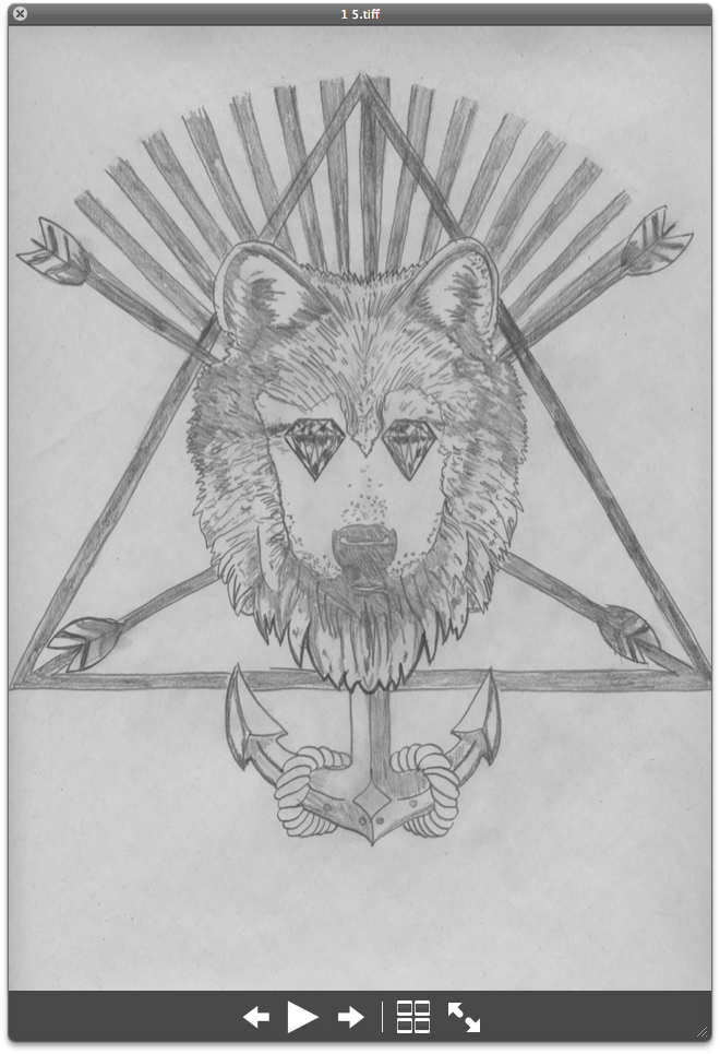
When scanned in the drawings lost a lot of tone and detail due to the scanners light, it made the image break apart and look very faded, so I then took the images into photoshop and edited them by first changing the contrast and image balance.


I then changed the image from CMYK to greyscale.


After greyscale was completed I made a duplicate of the image just incase something went wrong and then I still had a backup.


I then got the burn tool out and drew over a lot of the image to darken and rough it up so it looked interesting and dark in feeling.


To keep attention to the image I coloured in the corners so they lured the eye into the centre of the page.


There was a little situation which happened to occur as I was working through the images and that was that 3 of my images were landscape when looked at.


For the moment I ignored this and chose to move onto this problem once I got to the book lay out and order.


Once all darkened up I lightened up highlights using the dodge tool and sponge tool to make certain areas really pop.


I added my graphic signature/ logo at the bottom instead of doing some fancy writing saying my name.


Once completed I used the burn tool to go around the shapes of the main images and give them some shadow and depth which looked really good left the image looking like this:

Drawn and scanned.

I added all sorts of different ideas to the tattoo book content, I thought that it would be a wicked idea to incorporate this idea to add masonic angles to the main image which was the rose, by doing so it makes the whole work really work as a set.


The photoshopped images were really just a composition template for me to draw off of I added a lot of different ideas myself as I Drew out the art work, such as shading rain drops and other little incorporations.


I really love the way this image turned out, one consideration was to just leave the image outline but I found that with the shading it made the image look a lot more interesting and give it more of a feel to how it would look.


Below I drew out a day of the dead skull incorporating death with life, on the right skull and a sparrow which are key elements associated with death were as on the left flesh and hair ornaments.


Medusa was the most interesting concept I produced as it looks so much different to what I had originally drew out. I added the day of the dead effect, shading and rose boldness which made it look really cool.


Symmetry is important to me when thinking about a chest piece due to the body being symmetrical and the tattoo being placed in the upper centre of the body. This piece incorporates courage glory and hope, The eagles and sword for courage, the wings for glory and freedom the masonic eye for protection from a greater force.


This one is a really girly one with a bit of edge, lipstick and thunder is for the girls personalty, it's saying that there is more than what lies on the surface, but you have to look deeper.


This is one of my favourites, I love how the eye turned out on this one and the zombie hand as it didn't look like this when I laid it out on photoshop with the structural elements.


Templates

After working i my sketchbook I gained a few ideas and concepts that i wanted to take forward into design for my tattoo flash book. I mocked up the image in a neater platform using photoshop and various images merged together.

The below item uses wings lipstick rays clouds thunder shadows and scrolls to make a bold piece, one of the major items to remember to incorporate in a design is the background so it looks complete and fills a bold space.


Below is a piece which features hands scrolls wings a heart a key padlock and rays which I think turned out really well.


Masonic eye candle triangle compass eagles rays sand timer and skull


umbrella thunder clouds lightening a light house roses scroll waves and flowers looks really good in a combination.


Hand scroll bones and eye, for a zombie concept piece.


Wolf diamond triangle arrows rays and a anchor.