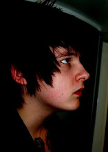
Thinking about the drawing I knew something was missing, which is when I thought about adding a mild duo tone.

I thought something like this was far to strong

But when moved down it was much more subtle and looked very interesting and made me think this is what it is missing.

The issue then was choosing a colour, I needed something which didn't merge to well with the image for when the imagery was being traced.

Greens and blues were therefore out the window as they are to close to black.

After trying a lot of different possibilities

I got towards the red and orange which gave the illustrations a burned and oldish appeal.

I then realised I was on the right track but not quite there

I soon got to red and felt as though I had gone passed the colour I needed

So I messed around with the yellow pantones and discovered a mild creamy yellow which worked perfectly with the pencil and had enough of a contrast which complimented the imagery as well


No comments:
Post a Comment