Thursday, 11 November 2010

Merging images


The appropriate start for this project was to mock up tattoo designs to refer to for when I drew them out, I did this by building up different images in my head then finding a visual for them online and merging them together to produce an item like below:


This is one of my favourite images I produced, I think that it looks really cool and works well as a full set, and when drawn out in pencil to be put in my book it will look totally different again.


I love the idea of this one, merging both death and life together and using the crow on top of her hair to symbolise an evil.


The next step was to scan in the drawings I produced at a high resolution to keep all the quality for when the image size was tampered with


The image looked like this when finished, still some more photoshop tampering to be done to find the best appearance for this piece.

printed t- shirt

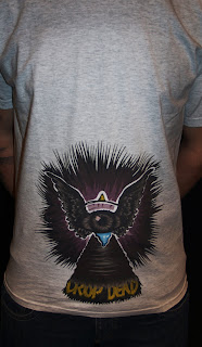
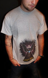
I received my professionally printed t-shirt earlier today just in time for my crit. The item cost around £15 but came a little different to when i ordered it, in reality the print should have been a lot bigger but it was shrunk down.


The colours came out really well and the item was a success on the cotton material.


Laid out the t- shirt looked great and very professional within a shop layout context.


When worn the image sat a little far south but it worked quite well for this particular piece.


It gives a look again factor, where someone will walk passed and take a second glance as they didn't notice there was a image printed the first time round.


The colours and image layout work really well in this low down content, the colours have shown through dramatically well in comparison to the heat transfer process used on earlier t-shirts.


I am pleased with the outcome overall and would love to get more t-shirt designs printed this way.

Cake concept

As with halloween trick or treat is the most used phrase it seemed a lot of sense to produce something such as a cup cake with the faces incorporated on, or even so they stuck out of the cake a bit like an ice cream wafer/


Another idea was to have each letter of front sticking out on this.


Mocked up digitally the items would look something like this


The packaging would be the cup cakes wrapper with front written on it.