Thursday, 4 November 2010

Type time

In looking into different typefaces I wanted one which really linked in with the theme of horror I like this font but it seems to be a little to wavey.


This typeface is a strong one and looks quite gothic which looks as though it would fit in well with the surrounding characters.


This typeface is to distorted and messy


Loyal is to fun and waved it looks like a bad/ worse comic sans.


Messing around with type I thought about using different colours but it seemed that it took to much away from what was meant to be looked at.


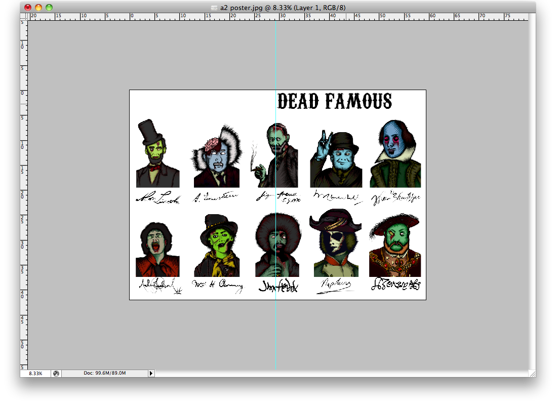
I tried different layouts with the type face I chose to best suit the surroundings of the project.The left and right layouts seemed to look bad and the typeface was far to big to be taken seriously.I moved the type into the centre of the page and it began to look a lot better and more professional. The only issue was that the type was to big.So I shrank it down to an appropriate size and now am ready to print it out to see how it looks as a product.

Poster layout

I thought as I changed the brief it would be a brilliant idea to get some of the front fans involved with the party even if they couldn't be there to enjoy it. The way of attacking this situation was to produce a special Dead Famous poster for front fans.
I first had to get all my images onto one page.


Then find a way of organising them in a way which was appropriate, rather than ranking them I thought a simple way around the situation would be to alphabetically lay it out.
Abe
Churchill
Einstein
Henery
Jimmy
Michael
Napoleon
Shakes
Sig
Will


I then added the front logo at the top but the white space seems as though it needs something to fill it out, I think I am going to experiment with different typefaces to spell out DEAD FAMOUS above them.


mag

With changing my brief from the editorial work to the party theme I still thought it would be a shame to lose the label of Front so I chose to incorporate them by them being the hosts. This work below was for when I was organising the cover type and layout size.


The typeface still should be incorporated somewhere so people know who's party it is.


I lay out the type to match that of a magazine I scanned in just to keep the scale to an appropriate format after I had re sized the imagery.


Below is an image of the halloween type I produced and am very happy with as it answers the solution of transforming the problem that front wasn't scary enough to giving it a zombie kind of edge.

Online

Below is a basic mock up of my items in context in a web presence located on Drop dead's website. This is a rough idea of what the items will look like when located on the website.