My problem is creating a dvd at the moment based upon a introduction to basketball. I have been studying information based upon the NBA, scores, top ranks, Most popular players, signature moves and other aspects related to basketball. Also I have been looking at channels in which my introduction would take place. Some channels I have been looking at vary from Sky one, to Sky sports to late night five. I am still undergoing research into this. Some other areas I have been looking at is the culture and background of basketball. I discovered that Hip-Hop is best associated with basketball (also it is a highly rated American sport).
I have been looking at visual material such as images, NBA magazines videos about the NBA and street ball and some And 1 mix tapes. I believe with the time available a lot can be achieved as long as I prepare storyboards and know my limits and keep things simple in a way in order to produce something of decent quality whilst being new to after effects. I have been evaluating my decisions by experiments on after effects and flipping and moving things around on my storyboards in order to make some parts make more sense and look better on screen.
I want to develop some sort of interactive feel with the dvd, like the watcher is some way involved with it. I would like to communicate a strong American feel to the video i.e sticking with reds and blues and I really want the video to be in your face with crazy american style sports graphics (as I have researched in my design context) My audience is based around 21+ American Basketball fans.
I have identified that I am rather poor at after effects and that it will be a struggle to produce what is in my head. But I believe with enough hard work it will come together alright. I require more channel research and need to find out if what I am making works as a whole. And really states what I want to promote which is Basketball. My intention is to produce a 30-50 second clip which says top ten basketball legends. but really has a street ball kind of edge to it. Quite urban if you will as And 1 and NBA are very well associated together.
From my initial starting point I believe that I have moved on a lot from where my designs originated. I have already come to terms with what I can and cannot produce with my restrictions. I think as long as I jot down more storyboard ideas and concepts I should be alright for developing my project. I plan to use after effects a lot as well as using the interenet and books as re sources from the library. I intend to use these workshops whenever they are available, late nights, days and saturdays if it is open.
Tuesday, 19 January 2010

Monday, 18 January 2010
first draft of intro
So this video is basically the first draft of the introduction and is how I was thinking of having the video go, I think theres a very lot of work to do on it but At least this is a start.
Saturday, 16 January 2010
Videos to help me understand movement on screen (some are the wrong way round. stupid phone camera)
So for my video I thought it would be a good idea to get my mindset back into the basketball standards, in order to understand the movement of a ball and baller.
I carried out some experimentation on spinning the basketball and dribbling. pretty rough though
I carried out some experimentation on spinning the basketball and dribbling. pretty rough though
Friday, 15 January 2010


Thursday, 14 January 2010

Wednesday, 13 January 2010
The Sin City concept
I carried out a few examples of playing around with black and white and colour:


So
I have chosen the top ten brief and my subject matter is top ten basketballers of all time. There is a lot I would like to incorporate into this video, I would like to make things look handmade and maybe urban so sub cat:
What words describe basketball?
What is urban?
I have been looking into the i-pod dance videos and the two colour scheme caught my attention and the lack of detail which makes me think that It is something I can incorporate into my video without worrying about it being a real time consumer. Although looking into different colours I think I would like to try something a bit like sin city. I'm going to do some experiments using drawings, stock production and video to try out a few moves. and take the key frames out of them. I am going to look into different basketball moves I can use. I do not think gaining endless information to back up my top ten is necessary as that would be making a program rather than an introduction to one. Completely different things.
Reds and Blues.
Also I was thinking about this ident being advertised on sports channels such as: Sky One and ESPN, Even channel 5 late night.
Tuesday, 12 January 2010


Monday, 11 January 2010


Monday, 4 January 2010


Friday, 1 January 2010


Thursday, 24 December 2009
few sneaky ideas before i commit to a top ten
One thing i am very interested in is the top ten man made wonders of the world
as well as the natural, here is a diagram I drew of where these wonders are located in the world

Here are a few basic images of the locations attractions.

as well as the natural, here is a diagram I drew of where these wonders are located in the world

Here are a few basic images of the locations attractions.

Tuesday, 22 December 2009


videos
This piece of work was highly experimental and was suppose to build a computer and a mouse, although with this piece I learned all about key frames and how if they were not evaluated and used right, they would stab you in the back. A steady flow was not what this piece had, it was to slow at the start and rushed towards the end.
With this piece of work I wanted to create a video that was built up of clicks, almost like a pacman biting away, My 3 colours were gold, black and white, these colours made an interesting and very complimenting combination together. I believe this video is my strongest out of the 4 and my best attempt at a Ident for after effects, I believe it really states the word CLICK.
I incorporated my typeface of mouses with this one, again I wanted it to look jaggard rather than smooth running, I made the mouses work abit like a chain which looked interesting on the final product. However I think if it was smoother it may roll a lot better.
This idea was again experimenting with a stock frame motion attempt of things, I do not think that it was successful but it really opened my eyes on how to use aftereffects and what the pros and cons are of using such materials.
With this piece of work I wanted to create a video that was built up of clicks, almost like a pacman biting away, My 3 colours were gold, black and white, these colours made an interesting and very complimenting combination together. I believe this video is my strongest out of the 4 and my best attempt at a Ident for after effects, I believe it really states the word CLICK.
I incorporated my typeface of mouses with this one, again I wanted it to look jaggard rather than smooth running, I made the mouses work abit like a chain which looked interesting on the final product. However I think if it was smoother it may roll a lot better.
This idea was again experimenting with a stock frame motion attempt of things, I do not think that it was successful but it really opened my eyes on how to use aftereffects and what the pros and cons are of using such materials.
Mouse movement and storyboarding
With taking everything into consideration with the exploration into the word click, I decided to think about a lot of the common movement we make with a mouse and came up with some of the following movements which I could then use in my storyboarding.

This storyboard consists of a lot of mouse movement but in a more rellative way the movement of the arrow makes on the screen when the mouse gets caught on the bottom of the mouse mat.

The next few storyboards again represent the movement and stamina of a mouse, in different situations in every day life.

This movement is based on the click of a button, the letter basically carrys out the process of a button when it is typed, squashed down and raised up in a short but sudden movement.

This piece was a big experiment to test my skills on after effects and was used to make rigid movements of zooming like when you click on the magnigying glass and it increases the page by 25% the main trick was when it got to a bold screen when it changed colours and made a different cross over.


This storyboard consists of a lot of mouse movement but in a more rellative way the movement of the arrow makes on the screen when the mouse gets caught on the bottom of the mouse mat.

The next few storyboards again represent the movement and stamina of a mouse, in different situations in every day life.

This movement is based on the click of a button, the letter basically carrys out the process of a button when it is typed, squashed down and raised up in a short but sudden movement.

This piece was a big experiment to test my skills on after effects and was used to make rigid movements of zooming like when you click on the magnigying glass and it increases the page by 25% the main trick was when it got to a bold screen when it changed colours and made a different cross over.

click type
After experimenting with the mous type I thought about other things which were used in representing the word click, electronicly. It was when I thought about combinding a existing typeface with an arrow such as the one used on a computer screen which allows you to navigate and select/click things to your desire. I chose to use the typeface 'ALBA' because it is very curvey and displays different mouse movements very well, in comparrison to a sans serif typeface or a really rigid mathmatical and angled type face. This one was smooth and fun, just how i wanted the tyeface to turn out

Mouse type
Throughout the productive thinking on the word click, I decided I wanted to make something that was relevant to the word, through a fancy type as designing type wasn't my strongest of points. I decided to make a type based up of different hand movements when holding a mouse. Here are a few examples of letters being made with my hands .

After I had documented the letters by my hands being curved into different positions I drew out an idea of what I wanted my typeface to look like. Then I used the pen tool on illustrator to bold out the letters.


After I had documented the letters by my hands being curved into different positions I drew out an idea of what I wanted my typeface to look like. Then I used the pen tool on illustrator to bold out the letters.

Monday, 21 December 2009
mouse type two
After I had designed a concept of the typeface, I had to think about colours and how I wanted it to be represented, I chose a palette of 3 colours max and experimented with a series of different colour combinations.

In the end I found it most appropriate to stick with Black and White, as they are basic and Key colours to a mouse. Also the contrast pays compliments to the design and does it a lot of justice.

Within the whole type face I would only be using three letters which are C,L,I and K which form the word 'Click' when put together as shown below, I think the typeface was a great success and I am proud of the outcome.


In the end I found it most appropriate to stick with Black and White, as they are basic and Key colours to a mouse. Also the contrast pays compliments to the design and does it a lot of justice.

Within the whole type face I would only be using three letters which are C,L,I and K which form the word 'Click' when put together as shown below, I think the typeface was a great success and I am proud of the outcome.

Monday, 7 December 2009
After Effects

First of all we had to install the program which was easy enough, Scratch, Applications, Adobe Aftereffects.
We then installed it and it gave us a screen like the one below:


We then uploaded a document from photoshop which we had prepared earlier, file, import, file and then select the given file. (depending on how many layers the file had we could choose whether to upload a certain layer/ all of the layers seperate or as one final image with the layers combine)


We then went across to effect and selected new composition.


This gave us a box like the one below, which we had to alter the settings of to meet the requirements of the brief. first of all we had the choice of naming the compositon, i.e. silent movie click one. then we had to change the settings of the screen to widescreen 16.9 square pixel and to finish it off we then changed the settings to how long the video was (5 seconds) although with a bit of experimentation it is better to leave a few seconds on either end in order to keep all the footage for when you upload it.

These are the settings the screen should be:

Then when selected this screen should then appear.


To change the background colour select composition and then Background colour.


And then we had a play around to get use to the program, by clicking layer and text or solid we then were given a object to manipulate and mess around with.


I chose a simple square, 100x100 pixels


Whic appeared as so:


Below is the timeline which defines how many seconds/ frames there are over a period of time set to the video, so it can be made accurate.


Below are the time line squares for the layers. each one reperesents the same amount of time and shows a list of timed movement from when and where it appears on the page to when it goes


This then looks a bit like this:


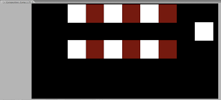


And alakazam Chris produced a shocking first attempt at indesign using keypoints, composition, colour and much more.
Subscribe to:
Posts (Atom)