Wednesday, 6 October 2010

Colour and placement

I laid my design out on some mock up vests to experiment with colour and see how they look in combination with different coloured shirts.


I found that the bright colours took away from the image and made the whole idea a mess.


The darker colours look quite interesting and compliment the image rather well, especially the purple one.


White and black seemed to be the best, I found that black really looked good with the design.


This is the scale and layout I want to try on a vest, I really like the idea of having the image wrap around the ribs of the top.


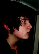


I want this type on the back of the top in a small point size this is the theme for the t shirt


No comments:

Post a Comment