
Green looks really cool as a background colour, it is vibrant stands out and creates a wealthy attention.


Pink in my opinion doesn't look like it is settled quite right.


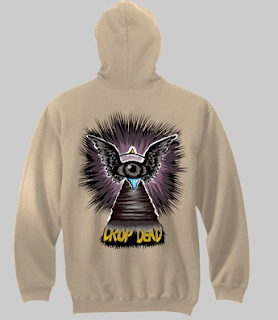
I then thought about cold weather wear such as hooded sweatshirts.


The designs would be on the back as there is more room and would be big


I think that a lot of these look really cool and fits well around the frame

The red is cool but the layout could be missing something so I began to experiment


White looks amazing in my opinion


This is to stretched out and it looks a bit odd


Red and blue are a clash but this item could get away with it.

Grey is suited so much better for women's wear


subliminal looks really cool as well


I found that that the designs really complimented some of the fashion wear used today


I strongly agree that these could be seen out on the market and in retail


providing the image layout fits well


The issue with this is that the design is so wide it wouldn't go bigger to fit the Tank tops limits for print.


No comments:
Post a Comment