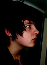
I am designing this in full colour and in a nice handheld scale of A5.
At first I was going to have the images on one side and the type on the other, but after I messed around with it it seemed better to have the image spread over this is good because:
-all the images are different shapes
-they are all in different formats
but may be bad due to:
-folding of the book, creasing the ink.

This image was the worst to lay out due to it being so wide, this seemed to be the best scale for it as when I made it smaller to fit on one page it did no justice for the image and made it under A6 sized which left far to much white space.
This image again was a little wide, I chose to have some of the images background spikes cut off in order for the composition to work, it isn't a big deal due to it not being the main image that is cropped.


I then added the type in for the lyrics and tried all kinds of ways of laying out the type. after carful consideration of what typeface to use I narrowed it down to a simple legible Helvetica Nue and using a bold to highlight key transactions from the lyrics in which the image was born.


As can be seen below I messed around with different layouts and in the end it seemed best to central justify the text and use a Pt size 8.


I thought that the titles should stand out more than the lyrics as that is the main reference for the customers if they want to listen to the song to hear the lyrics.


I chose to cut the lyrics in half on this page in order to work around the illustration, I believed this is the best way to do things in order to keep clarity and not have to mess around with transparency's which may lead to some print mis haps.


Some titles were long so I condensed them down to make full use of the page rather than having a long title on one small line.
The typeface I used had some ineligible characters in it, such as the letter 'r' I chose to use a higher case 'r' 'R' for this so the title is read correctly and it says over not oven.


The main thing I believed that was missing with all this is the pages seemed quite clear.
I then added a gradient which I thought looked quite good, then overlaid a colour which worked in colour scheme with the particular page the viewer is on.
I cut it off half way to make use of the white space and give an interesting effect which creates a visual hook across the page.
I coloured in the type a little brighter for the title just so it stood out that little bit more and made the reader realise that is where to start from.


I had a big problem with this image and its white space which is when I chose to make the gradient a little thinner, which isn't that noticeable and I think gives the image a bit more of a breathing space.
Same issue with the red page and text but I will have to print it out to get a preview and change the opacity if need be.
All that is left to do for this is:
-Front cover
-Back cover
-Index
-Page numbers
-Test print
-Finish print


No comments:
Post a Comment