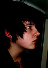
I think the sepia light makes the colours in a wrong contrast and sets the tone in a more erie kind of mood which does not link in very well with the idea.

The AV texture looks interesting in static but I think the colour is vital towards this final for it to work well.

Again as cool as the image is on photoshop in a drawn kind of filter it needs to be a phsycal out come.

Which is when I decided a slight bit of alteration on the product is all that was needed and in the end I think it looks really good like this and it gives the product an interesting kind of power.


No comments:
Post a Comment