Saturday, 4 December 2010

briefs


For the band steady your aim. I thought it would be a great idea to incorporate the ironsight of a gun with a grizzly threatening animal. I chose a bear.


I drew half then reflected it.


and hand drew some type.


and edited it in photoshop


This work for me looks awful, I need to take it to the basics, and change the type and the detail of the iron sight, I want to take this image down to basics and just do outline.

Tuesday, 30 November 2010

Logo

Once I mocked up the ideas of logos in pencil I had a firm idea of what i wanted so I went onto photoshop and drew out a template to draw from.


I worked from the template to get as much detail as possible in.


Then I began to add colour


I do not think I will be using the type in this but I have sent the illustration off to Matt to gain some feedback before I take it further.


Below is a photo of the vinyl cover with the logo attached.

logo

Matt also wanted a identity so I played around with a few ideas for paste man


I wanted it to be simple and stylish so I am producing some pencil ideas for the below


Background

After emailing matt he informed me he wanted a cool background which would fit around the scale of a vinyl 12x12cm. I thought that it would be a really relevant idea to try a wall of speakers, I first drew out the boxes.


Then i added texture to the speakers


and converted the colours.


I finally added colour, once completed I made a 12x12cm box ready to crop out the over run image.


I experimented with giving Matt a white outline so he stood out


It seemed far to much though and took to much away


So I took it away and this was my final outcome of the imagery.

Packaging

For my packaging I knew it would be important to keep everything related to pre existing drop dead products, in order for my new t - shirt designs to fit in I used the packaging that DD are using for all their products at the moment but I put my work in the packaging.


For mail order the carrier bag doubles up as a postage package


The t shirt goes in this product


The address and logo goes on the back with a address on the flap for where it came from.


So it looks like this when posted.


Within this package is another sealed package with the same logo branded.


Within this packaging there is a t shirt.


Front:


Back:


Packaging


The T shirt in the packaging:


When visiting in store the packaging is exactly the same but the first layer of the packaging has handles instead of being a postage pack.

Thursday, 25 November 2010

Illustrating

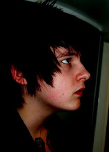
I got sent this photograph to take into illustration, I began by resizing it and examining what had to be done.


Once I had a basic feel for the image I drew out a faint template of what it would look like in structure.


I then used the calligraphy brush and texture to change the design and give it real structure.


I used a different set of brushes for smaller details to make everything fit together neatly.


Something seemed to be missing from the photo so I thought I would draw a new era hat on.


Which gave the work something it was originally missing.


I then added the colour and darker tones in.


Once complete I thought it would be interesting to merge both the photograph and the illustration together to mix the elements which ended up looking quite cool.


I then got an interesting idea of mixing a element of the illustration and photo together so it looked as though everything Matt touched turned into creativity.


A kind of forcefield.


These are the images I sent to Matt just to gain feedback and have a firm understanding of what he wanted to take further and how.