Wednesday, 15 December 2010

Evaluation

This whole module for me was a real eye opener for what I wanted to focus on for the time being in my design career, which is illustration. I learned a series of other things along the way, which has made me a better designer in a number of different ways.

My original briefs I had wrote were ones I wanted to do and for people I would like to work for in the future, I knew using these purposed briefs would get me the portfolio pieces I wanted. Since leaving second year I knew it was time to focus on myself and what I wanted to do and that is what this module was all about for me, in terms of my rationale I mentioned things which I had previously learned from the prior two years at Leeds college of art and I wanted to focus on these elements in order not to make the mistakes I had done before and in order to make the module a fun and challenging one.

This module was a bit of a slow starter for me as I worked out what I wanted to do which is create illustrations for clients in various contexts suiting the brief, but my main issue was that I was not creating the form of illustration I wanted to, in working on the drop dead brief (brief one DD) I learned all about using the wacom tablet, which was the main gain out of the brief, the brief stretched on a little bit longer than I had originally intended due to it being such a long start getting my head around drawing straight to screen and learning all about different strokes, textures and calligraphy brushes not to mention file sizes, formats and scaling. Round about illustration two I started to get the hang of the tablet and was able to complete my drawings a lot faster and neater than originally.

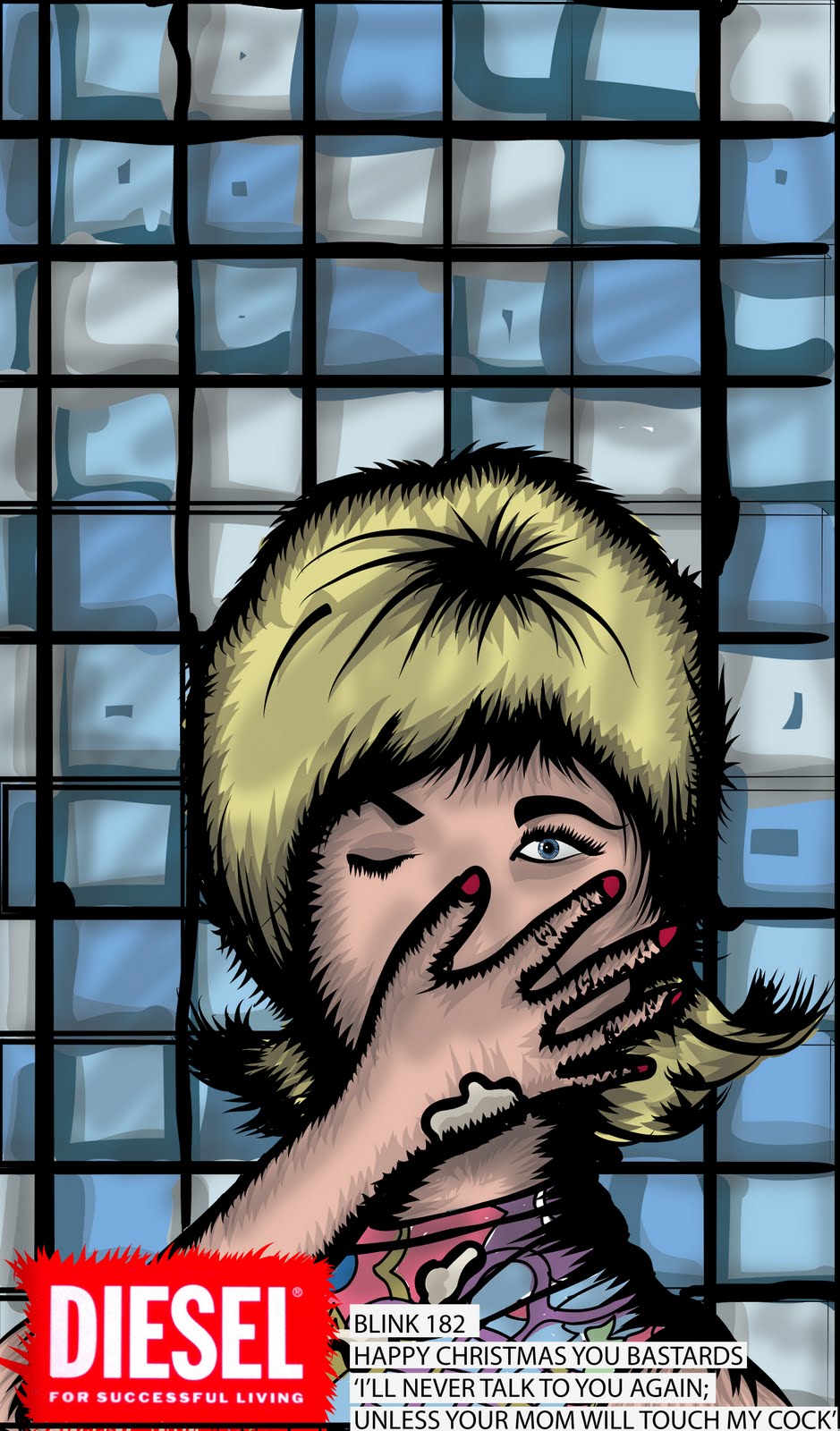
My second brief however (front) was one which was a very misled brief and taught me all about how even though you have wrote a brief sometimes you cannot stick by it and it needs to be altered, I found myself producing editorial work which is not what I wanted to do same with (DD) the publication in my design practice is not what I had intended on doing and after altering the briefs I chose to get rid of areas of the brief to simplify them and extend on the stronger areas, front ended up being completely changed to Halloween decorations which in my opinion made a lot more sense and it looked a lot better once I had mocked up some of my ideas for packaging and products, I found that the napkin I made for this brief was a very successful piece and once it was changed to decorations I had a lot more fun producing for it.

Looking into time scale and organization there were a few problems along the way the first few projects went more or less according to my time table in my progression folder but there were key areas throughout this module were things went really wrong, the 6th of November being the worst one which was when I got home from the army one weekend and found that my Mac book would not turn on which meant I had lost out on blogging and digital design for Sundays and any time after 8-9pm once college had shut, and the two pathetic snow days off were awful for me as I needed access to the Macs at university at least. I also lost data for some of my day briefs, which were progression screen grabs, and extra file of ideas, which are still unable to access. Due to having some financial difficulties lately it has strongly effected a lot of the module, one being that I couldn’t mock up a lot of my projects which I had been looking forward to doing and the other being I couldn’t get my Mac book fixed until after submission. After this situation happened it left me in a odd state which meant I had to work faster and in more detail as I knew I would be missing out on some long nights, as when I get home that is when a lot of my ideas flow being away from the studio.

Due to this set back it was very foolish of me to produce so many small briefs which left a lot of my time really slim especially due to the fact that there was no way I could focus on over time work, However once getting some pay in by the army I was able to finish off a few projects one being the tattoo flash book which taught me all about producing different kinds of illustrations and producing them for a odd scale using different stocks and print processes not to mention binding, I found this brief a very rewarding one and felt as though it was one of my strongest briefs I had completed as well as drop dead in which I learned all about different types of t-shirt printing and which works better for a contextual piece which answered the briefs specification.

I found that although a lot of the odds were against me I was able to produce all my boards, admittedly not in the quality I originally wanted but to a high enough standard to present them and in a very clear manner a lot better than any of the other boards I have produced over the years here.

Overall I answered the aim of my rationale and produced the work and gained portfolio pieces that I am very proud of showing off, using these forms of illustration I have had a few responses and gained a few clients who just want drawings doing for them which is great for me as I haven’t had anyone so interested in my work like this before. The module has been adventurous and a great learning experience were I have gained many new skills and have learned a lot about different processes and what can go wrong in them, most of all I believe the best thing I learned was how to juggle a series of briefs at one time. With the time I have left on this course I want to take my next briefs to the limit and go all out as I now know the power of context, I am very excited to start designing and starting something new, I know this is what I want to do now as I am still excited about my work and love what I do.

Monday, 13 December 2010

context

The illustrations will be promoted at big music festivals around the UK such as Leeds, Reading, Glastonbury, T4 on the beech, download and slam dunk etc. The illustrations will be used as giant banners stretched across main stages were the acts will be playing this is a great form of context as it will get the music fans interested in what the illustration is all about and what it's purpose is, which is to smile.


After seeing promotions some of the products will be sold online via diesel and blink 182's website.


on Diesel music under the category be stupid, there is a online portfolio of illustration work in which the three illustrations will be displayed with a automatic link to facebook to share out the photos. like them etc.


The products in context will be worn and displayed by fans, things such as stickers and badges are very strong promotional items as they are worn subliminally which leads to a greater effect on the viewer long term, it is something that is always there if it is stuck on a bag or laptop.


sticker and badges.

The following images are of the final set of stickers, this is the mom one:


the full set of badges and stickers.

unless your mom will touch my

In order for the illustrations to work as a set I chose three different quotes which included three forms of sexual relations, fathers moms and self.

This illustration was for 'ill never talk to you again, unless your mum will touch my cock'


I chose a real 60's house wife kind of look to go with the kind of humour I was going for.


I thought a good idea for the background would be a tiled kitchen/ bathroom as that is where 60's wives were associated (house work)


I added texture and the title and the result was great the three worked very well as a set

Saturday, 11 December 2010

Promototional

As the briefs audience is related to Blink 182 fans the main source of advertising for the band are stickers on walls, bikes, laptops.. badges on the back of bags, coats etc
below are the stickers which look like small versions of the big posters I produced


Below are more stickers and badges, these ones are screen shots of the main image using a view finder and selecting certain areas, for example the top two are the main illustrations and the bottom two are the band, song and quote.

Development

I'll never talk to you again unless your dad will suck me off is the title for my illustration. I selected the idea of drawing up a image of a older man with his mouth open looking a little bit like a panting dog.


I had to make it look as dad like as possible which meant wrinkles, grey hair.


The next step was putting it in context


I added a background of wood, such as a man related hobby. i.e. tools DIY, 'dads shed' then added in the logo and some type explaining the song and quote. I really like the outcome.


Image final

After some more drawing I chose not to carry on the process of the drawing with type and chose instead to give a punk rock kind of ransom note effect and added it in at the bottom along with diesels logo

in context

The labels made mocking up easy enough, the napkins would be folded in half to make triangles and to save space for other products. The label is placed flat over the napkin.


The table cloth would be folded u into a clean square and the label would be placed over all of the front completely covering it.


The cups would be in a stack, but I do not have a photo to use to show this, the label would wrap around the body of the cup and the cups would be stacked in one another and wrapped in plastic.


The same would happen to the plate.

labels for packaging

I wanted all my packaging to be plastic wrapped with clear labels so the main bit of packaging was the labels. I worked out the shapes they had to be circle for plates. cup shaped. rectangle and square for napkins


I wanted them to work as a set and also work with the illustrations so I chose a zombie green.


Then constructed a spooky texture


and then added the label of the dead famous party wear brand.


I then chose a clear typeface and added type and information about the product on there.

Friday, 10 December 2010

FIinals

Again this was another quick turn around brief where I mocked up a t-shirt and stickers for a local band, they told me that they had had a name change and that stopped the brief mid flow and I was informed that they would get back to me as soon as they have a name and we would then carry out type to the image.

Summary

Although this was the shortest brief I had done I got carried away with it and jumped straight in, I have no backup work for this project due to the fact that my macbook is broke and all my back up work is on there, this has taught me that even though you have a macbook rather than a pc doesn't mean it is reliable and that I need to start back upping all my work to my external hard drive so that I have more to show for my project rather than the final pieces.

Finals

These are the finals for the project:
letter
envelope
seating cards

Summary

In this brief I learned how to produce fliers and posters in a short period of time once receiving the brief, it helped me concentrate on my decision making and get it to a level where I know what I want and what has to be done by when, it was a great project to carry out and although the final products couldn't be photographed in context due to security reasons at the Queens barracks the 269 Artillery loved the finals and it got them really excited about the christmas event.

Summary

Drop dead was my favourite of all the briefs I did, I set out on what I intended to do which was learn how to draw with the Wacom tablet and produce T-shirts using different methods of print rather than just screen. I learned about time keeping and how if you get one thing wrong everything soon follows, mid way through the brief it came to my attention that I needed to re write the brief before everything got out of hand and I produced something which would put my other work down i.e. the publication.

After working out what I wanted from the brief it all became clear what I wanted to do, if I was to do it again I would like to try different ways of printing maybe making some more things such as decks and bags, the project was about me learning how to draw but I learned that the context of what can be done is unstoppable, you just have to think big rather than focus on drawings, what do the drawings go on, what could they go on, bags? boards? walls? the list is endless.

I am very pleased with my outcomes and have learned a great deal from the project, it has opened my eyes to new possibilities and has made me a better graphic designer.

Context

As drop dead is a well known range and I am trying to reach out to the pre existing fans I chose to use the t-shirts illustrations to advertise the brand in a self explanatory way for existing fans. I think that if people like the designs they would be intrigued to find out what it is all about which is why I left a simple link to the website.


When logged on to drop deads website the page below will appear:


This features different ways of navigating through the site wether it be by type of clothing, new, old or even if its free extras.

Summary

I enjoyed working for Matt, he was a great client and I got a lot out of working on the brief, I learned all about communication between clients and designers factors that had to be taken into consideration and all about how if you do something one way you like they might not like it.
If I was to do the brief again I would change the type on his logo but Matt likes it that way. other than that I would of liked to have the time to make a physical version of the vinyl cover which I would like to do later on once I have some spare time.

In conclusion I am pleased with the outcome of the products imagery and have learned that it is possible to do a quick turn around brief in such detail.

Final

This is my finished piece for Matt, I included a few extra items for my brief, he originally did not want a back to the vinyl but I added one with a few of his tracks, I used a speaker texture that linked in with the front of the cover and used a plain clear type face.


Summary

Throughout the project I learned a lot, I stuck to the briefs limitations and came up with a solution to the problem at hand, I am pleased with the outcome of the book, I found out all about foil block, screen printing page layouts and how to draw. I had many problems from the beginning of the brief throughout, I solved these problems by decision making, for example:

Pencil or ink, I produced both and chose the one I thought was more appropriate
Foil heat transfer, when all my screens went wrong and the ink didn't take as well as the paper stock getting destroyed I thought of a way round it using standard ink.
Page layout and binding, a3 ring binding is a hard and expensive thing to find for producing mock ups, I designed all my pages for a standard landscape bound but my front pages got altered because of the process.

If I was to do this brief again I would use a different stock for the front and back, I would like it to be a card like a sketch book I also would bound it the way I originally intended.

Wednesday, 8 December 2010

The process to the context

Once you have the sketch book the next stage is to choose an image and then pop it in the scanner.


Once you have a scan of the item (so you don't ruin the book) you then make sure it is the right size, once to a desired scale it is then time to lace some special ink paper underneath then place the scan on top or a piece of paper.


you then draw over the main areas of the image


Making sure to apply lots of pressure so it all transfers.


When completed you then peel off the paper to get to the tracing paper underneath


If done correctly it should look something like this:


It is then time to work out where a-bouts the image will be going on the body, this is vital as it is on the person forever, for pieces like so the symmetry is the key and around about the centre of the chest is where the image should lay.


When chose apply pressure to the paper in order for the design to transfer across to the skin.


When satisfied peel away the paper.


Once removed the ink work should look something like so in blue.


Then it is time to be tattooed.

Tuesday, 7 December 2010

Finals

I had organised to get my book bound with wire landscape at a place in Leeds called Hollingworth and Moss but they charged £40 for a bind to be done in time, other wise they were fully booked up, so as I had already printed off the content I had to find away to bind the book


I chose to punch the holes into the book at the top, luckily I had planned on such an incident occurring so I changed the designs to allow for a bind to be complete either on the top or bottom. There was one problem with this which was the landscape drawings position.


The first 3 drawings are placed upside down if the book was to be looked at landscape, but the way this still works is by when they are scanned at tattoo shops it doesn't matter which way it is, at the tattooist Inkvs Steel in LS1 I was informed that when scanned in the work tends to be portrait as a rule to save on ink and unnecessary extra scanning to the book if it was placed landscape. i.e. less messing around


The portrait images look really appropriate and are laid out very well.


The first page is a content page giving the scale author and title


The landscape images work very well landscape but if I was to redo it after my deadline I would change them round.


Everything else works well together and fulfils the purpose of its creation


the scale is just under a3 at 11.5x14 inches


and it is bound with a black plastic bind to fit in wit the colour of the 2 colour cover plus stock.


I am very happy with the results although I do believe I will alter the pages if I can get down to print in time.